Enter your email address to download and customize spreadsheets for free
Hai bisogno di visualizzare i tuoi dati? Utilizza questa nuova risorsa di Grafici definitivi per grafici Marimekko predefiniti e completamente personalizzabili, grafici a bolle, grafici di analisi di Pareto, grafici di borsa, grafici a barre verticali e grafici a istogrammi per visualizzare la distribuzione di numeri, valori unici e intervalli di date.
Download free weekly spreadsheets
Enter your email address to download and customize spreadsheets for free
Not for commercial use
Download 'Grafici definitivi (Parte 3)' spreadsheet — 11 sheets
+39 more spreadsheets per quarter
that's $3 per spreadsheet
/ Quarterly
Commercial use allowed. View other plans


Hai bisogno di visualizzare i tuoi dati? Abbiamo creato questo nuovo modello di foglio di calcolo Grafici definitivi (Parte 3) in Excel e Google Sheets che puoi scaricare e personalizzare secondo le tue esigenze. Include grafici marimekko personalizzabili per visualizzare l'allocazione delle risorse o un portafoglio di prodotti, grafici a bolle per analizzare le dimensioni del mercato e i ricavi delle vendite, grafici di Pareto per valutare la produttività e il feedback dei clienti, grafici a scatola e baffi per l'analisi delle scorte, grafici a barre verticali per visualizzare le variazioni nel tempo e grafici a istogramma per visualizzare la distribuzione di numeri, valori unici e intervalli di date.
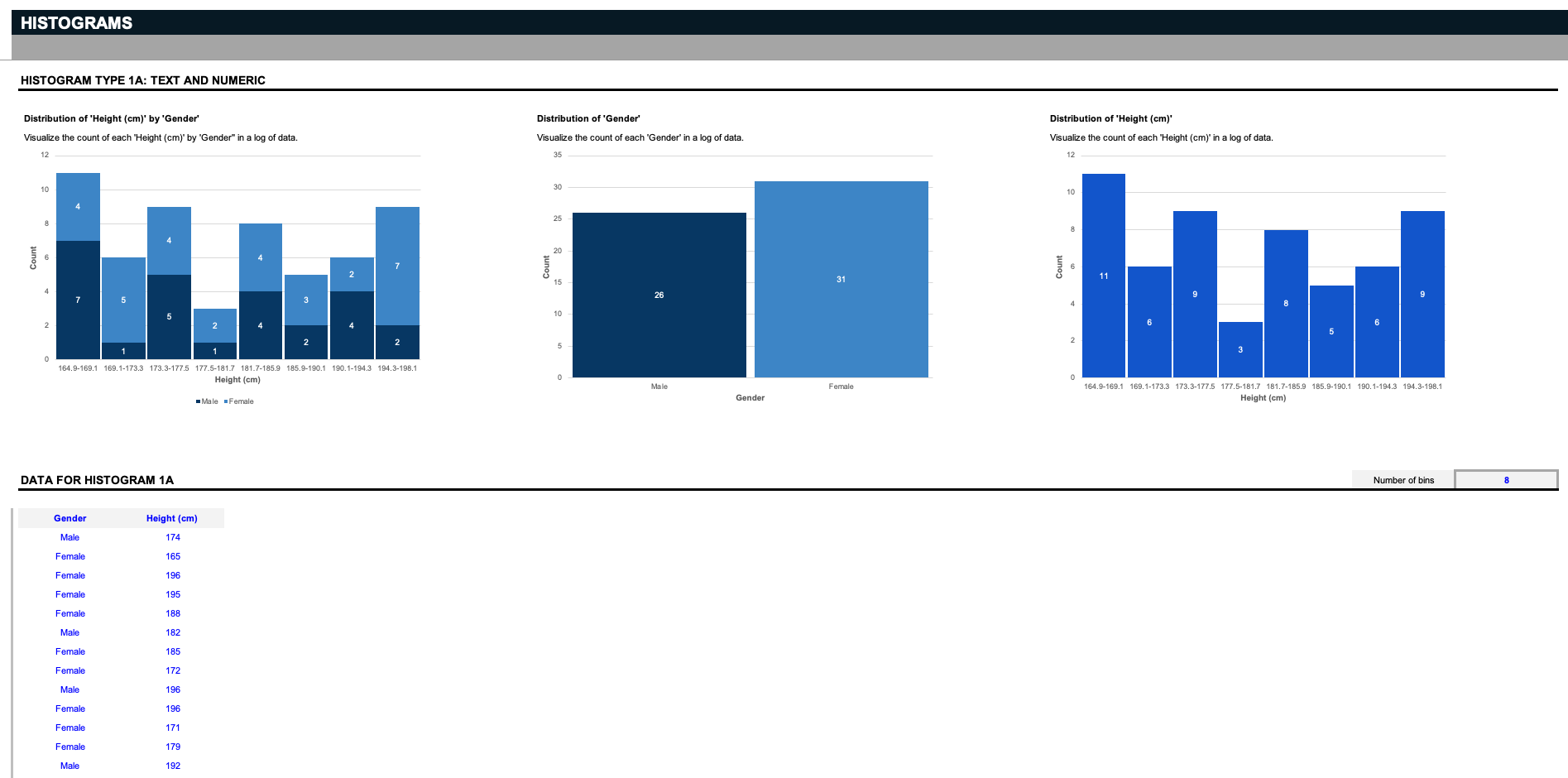
Prima di tutto ci sono i grafici a istogramma. Ci sono nove istogrammi unici in questo foglio di calcolo; tre per valutare la distribuzione di un testo e un numero... Tre per valutare la distribuzione di due valori di testo... e tre per valutare la distribuzione di un valore di testo e data.
Supponiamo che tu sia uno scienziato e che tu abbia un elenco di dati che coinvolge un determinato genere e altezza. I primi tre istogrammi visualizzano il conteggio di ciascuna altezza per genere, la distribuzione dei due generi o la distribuzione di tutte le altezze.Ma ricorda: questi input possono essere personalizzati come preferisci; diciamo che gestisci un magazzino e vuoi organizzare i pezzi correlati in base alle rispettive dimensioni; cancella gli input in blu e sostituiscili con le tue specifiche. I diagrammi a istogramma funzionano separando i dati in raggruppamenti chiamati bins. Qui, forniamo un semplice filtro per decidere come suddividere i dati.
Tutto quello che devi fare è definire quanti bins vuoi vedere, e i grafici suddivideranno i dati nei raggruppamenti appropriati. Nota: tieni presente che questi grafici a istogramma supportano solo fino a venti valori di testo unici.
[/italic]Ora diciamo che hai un elenco di valori - come un elenco di dati sui generi e il colore degli occhi, e vuoi trovare la distribuzione di ogni colore di occhi unico per ogni genere. Gli istogrammi dividono i dati in bins in base al numero di unici.
Prossimi sono i Grafici a barre verticali. Questi due set di dati di esempio tracciano le variazioni salariali nel corso di due anni tra diversi tipi di organizzazioni e ruoli, così come le variazioni nella quota di mercato di anno in anno per diversi tipi di prodotti selezionati dai filtri.
Come potete vedere, due prodotti e il loro rispettivo guadagno di quota di mercato possono essere confrontati l'uno con l'altro nei grafici a barre verticali. Ricordate - questi dati possono essere completamente personalizzati per adattarsi al vostro caso d'uso specifico.
Il prossimo sono i grafici di Pareto, che prendono il loro nome dal principio di Pareto, che afferma che per molte conseguenze, l'80% delle conseguenze deriva dal 20% delle cause. Questo è uno strumento di priorità per aiutare a identificare il prossimo passo più importante. Nei set di dati di esempio, abbiamo un'analisi di Pareto del feedback dei clienti che conta le occorrenze di diverse ragioni per cui i clienti si disiscrivono, e un'analisi di Pareto della produttività che conta il numero di colli di bottiglia mensili che interrompono la produttività dell'azienda.
Un altro tipo di grafico poco comune ma utile è il grafico a scatola e baffi. Anche noto come "grafici di borsa," questi set di dati di esempio tracciano il volume, l'apertura, l'alto, il basso e la chiusura di un dato titolo nel tempo, ma ricordate, questi grafici sono destinati ad essere completamente personalizzati secondo le vostre esigenze.
Prossimi sono i Grafici a bolle, con set di dati di esempio per tracciare il fatturato in base al numero di anni nel mercato di diverse aziende, così come la percentuale di redditività per le vendite di una serie di prodotti e regioni. Per questi o qualsiasi dei grafici precedenti in questo modello, se avete bisogno di più righe per inserire più dati, aggiungete nuove righe sopra il bordo grigio.
Infine, simili ai grafici a barre impilate sono i Grafici Marimekko, noti anche come "grafici mekko," per tracciare sia l'allocazione delle risorse per i punti vendita nel tempo, sia la ripartizione delle vendite di un portafoglio di prodotti per ciascun prodotto in diverse regioni.
Grafici Marimekko come questi possono confrontare i valori, misurare la composizione di ciascuno e mostrare la distribuzione su più dimensioni. A differenza di altri grafici in questo set di dati, questi grafici supportano fino a dieci righe di voci uniche.
I grafici sono il sangue vitale della visualizzazione e dell'analisi dei dati - senza di essi, le intuizioni diventano molto più difficili da sezionare. Per utilizzare tutti questi grafici oggi, è possibile scaricare e personalizzare questo modello di foglio di calcolo Grafici definitivi (Parte 3) in Microsoft Excel o Google Fogli proprio ora.Dopo di ciò, vai a controllare il nostro modello di foglio di calcolo Pricing Strategies per ulteriori grafici che ti aiuteranno a visualizzare la tua analisi mentre determini il prezzo del tuo prossimo prodotto.
Download free weekly spreadsheets
Enter your email address to download and customize spreadsheets for free
Not for commercial use
Download 'Grafici definitivi (Parte 3)' spreadsheet — 11 sheets
+39 more spreadsheets per quarter
that's $3 per spreadsheet
/ Quarterly
Commercial use allowed. View other plans

Abbiamo creato una nuova collezione di grafici per fogli di calcolo più avanzati e visivamente accattivanti per risparmiare ore di tempo. Inclusi in questa collezione ci sono: variazioni di grafici a barre, variazioni di funnel di vendita, variazioni di grafici a torta, mappa del mondo, grafici a gradini, grafici di varianza, grafico a dispersione e grafici radar, tutti facilmente modificabili e collegati in modo conveniente a tabelle di input dati.

Pianifica, monitora, controlla e comunica le attività in ogni fase di ogni progetto con la nostra Collezione di Diagrammi di Gantt. Assegna compiti al tuo team e identifica l'impatto dei ritardi in anticipo, migliora il coordinamento del tuo team, monitora le pietre miliari e assicurati che il flusso di lavoro e i risultati del tuo team funzionino sempre come una macchina ben oliata.

Hai bisogno di nuovi grafici e diagrammi per situazioni difficili da visualizzare? Inserisci i tuoi dati in grafici a esplosione solare completamente personalizzabili, mappe di calore, grafici a proiettile per visualizzare i principali KPI, grafici a termometro, diagrammi di Venn a tre e quattro cerchi, curve di campana filtrabili, grafici di milestone e grafici combinati con questa collezione di Grafici definitivi.

Hai bisogno di presentare le opportunità di investimento e di ricompensa di una nuova impresa o progetto? Utilizza il nostro modello "Modello Pro Forma Definitivo per Startup" per presentare una nuova proposta e mostrare i suoi costi, i ricavi e il punto in cui i flussi di cassa diventeranno positivi e raggiungeranno il critico "punto di pareggio".

Avete mai desiderato gestire un progetto come Elon Musk? O avere la capacità di prevedere il successo di un progetto come un analista finanziario di Goldman Sachs? Ecco gli strumenti definitivi per la gestione dei progetti per garantire il successo fin dall'inizio. Acquisirete la capacità di calcolare il TIR di un progetto, condurre un'analisi di Monte-Carlo per valutare il rischio, gestire i team con la matrice RACI, presentare una carta del progetto, monitorare i progressi con cruscotti e diagrammi di Gantt, e farlo tutto di nuovo, ma meglio, con un sondaggio post mortem.

Come si ottengono le risorse e il sostegno per portare avanti il tuo piano di business? Oltre a un'idea epica che risolve i punti di dolore del cliente, un solido pitch deck per investitori può aiutare a sigillare l'accordo. Utilizza il nostro ultimo Ultimate Pitch Deck (Parte 3) per raccontare la tua storia e comunicare la tua visione nel miglior flusso possibile e avvicinati al finanziamento di cui hai bisogno.

I rimborsi dei prestiti sono confusi e complessi da tenere sotto controllo? Utilizza il nostro Foglio di Calcolo Definitivo per i Prestiti per monitorare e stimare quanto capitale di un prestito è dovuto. Usa questo foglio di calcolo per analizzare: prestiti per la casa, l'auto, gli studenti e commerciali. Inoltre, analizza se la rinegoziazione di un prestito è un vantaggio. Come bonus, i grafici di ammortamento del prestito illustrano il preciso piano di ammortamento del prestito.

Hai bisogno di migliori visualizzazioni per analizzare e riportare i principali KPI? Utilizza questi Grafici KPI per inserire fino a un milione di righe di dati grezzi. Filtra poi un sottoinsieme da visualizzare e la bacheca genererà automaticamente grafici predefiniti per visualizzare i dati per i rapporti e le analisi. Questi potrebbero essere dati di vendita, dati su bug o problemi, una lista di cose da fare per un progetto, funzionalità da implementare o persino analisi del mercato azionario. Rinomina e personalizza fino a due intervalli di date, due valori numerici e cinque valori a discesa per filtrare e confrontare tra loro. Crea poi bellissimi grafici KPI per le analisi e i rapporti.

Fatica con le visualizzazioni dei fogli di calcolo? Utilizza il nostro modello completo di grafici per risparmiare tempo e ore di lavoro e creare bellissimi grafici e diagrammi per rapporti e analisi. Questo modello contiene una varietà di grafici comunemente utilizzati, nonché cruscotti per un'eccellente e rapida visualizzazione.

Arricchisci le tue presentazioni con mappe dettagliate delle regioni in cui la tua azienda è coinvolta. Con mappe di centinaia di paesi in tutto il mondo, organizzate per continenti, puoi evidenziare ciò che è importante per il tuo mercato e persino visualizzare la tua futura espansione.

Hai bisogno di creare grafici a mappa in Excel o Google Sheets? La nostra Collezione Definitiva di Mappe del Mondo include un grafico a mappa del mondo filtrabile, grafici a mappa filtrabili per ogni continente principale, tra cui Nord America, Sud America, Asia, Europa, Africa e Oceania, e un grafico a mappa filtrabile per gli Stati Uniti, che su Excel può essere personalizzato per qualsiasi paese.

Scarica il foglio di calcolo della Collezione Ultimate di Diagrammi di Gantt per sincronizzare i tuoi dipendenti e aumentare la produttività. La collezione include quattro tipi di diagrammi di Gantt. I primi due strumenti sono diagrammi di Gantt basati su progetti organizzati per compito e per dipendente. Il terzo strumento è un diagramma di Gantt utilizzato per programmare le prenotazioni. Il quarto strumento è un diagramma di Gantt utilizzato per monitorare l'uso e i costi dell'inventario.