Enter your email address to download and customize spreadsheets for free
¿Necesita visualizar sus datos? Utilice este nuevo recurso de Gráficos Definitivos para gráficos Marimekko prehechos y totalmente personalizables, gráficos de burbujas, gráficos de análisis de Pareto, gráficos de acciones, gráficos de barras verticales y gráficos de histogramas para visualizar la distribución de números, valores únicos y rangos de fechas.
Download free weekly spreadsheets
Enter your email address to download and customize spreadsheets for free
Not for commercial use
Download 'Gráficos Definitivos (Parte 3)' spreadsheet — 11 sheets
+39 more spreadsheets per quarter
that's $3 per spreadsheet
/ Quarterly
Commercial use allowed. View other plans


¿Necesita visualizar sus datos? Hemos creado esta nueva Gráficos Definitivos (Parte 3) plantilla de hoja de cálculo en Excel y Google Sheets que puede descargar y personalizar según sus necesidades. Incluye gráficos de marimekko personalizables para visualizar la asignación de recursos o una cartera de productos, gráficos de burbujas para analizar el tamaño del mercado y los ingresos por ventas, gráficos de Pareto para evaluar la productividad y la retroalimentación del cliente, gráficos de caja y bigotes para el análisis de acciones, gráficos de barras verticales para visualizar cambios a lo largo del tiempo y gráficos de histograma para visualizar la distribución de números, valores únicos y rangos de fechas.
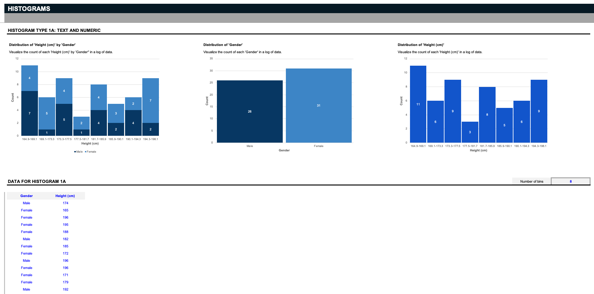
Primero está el Gráfico de histograma. Hay nueve histogramas únicos en esta hoja de cálculo; tres para evaluar la distribución de un texto y un número... Tres para evaluar la distribución de dos valores de texto... y tres para evaluar la distribución de un valor de texto y fecha.
Supongamos que usted es un científico y tiene una lista de datos que involucra un género específico y la altura. Los primeros tres histogramas visualizan el recuento de cada altura por género, la distribución de los dos géneros o la distribución de todas las alturas.Pero recuerde: estas entradas pueden ser personalizadas a lo que usted desee; digamos que dirige un almacén, y desea organizar las partes relacionadas por sus respectivos tamaños; elimine las entradas en azul, y reemplácelas con sus especificaciones. Los histogramas funcionan separando los datos en agrupaciones llamadas bins. Aquí, proporcionamos un filtro simple para decidir cómo dividir los datos.
Todo lo que tiene que hacer es definir cuántos bins desea ver, y los gráficos dividirán los datos en las agrupaciones apropiadas. Nota: tenga en cuenta que estos gráficos de histograma solo admiten hasta veinte valores de texto únicos.
[/italic]Ahora digamos que tiene una lista de valores, como una lista de datos de géneros y colores de ojos, y desea encontrar la distribución de cada color de ojos único por cada género. Los histogramas dividen los datos en bins basados en el número de únicos.
A continuación, tenemos los Gráficos de barras verticales. Estos dos conjuntos de datos de muestra rastrean los cambios salariales durante dos años en ambos tipos de organizaciones y roles, así como los cambios en la cuota de mercado de año en año para varios tipos de productos seleccionados por los filtros.
[herramienta pulsera="clcbyei805"]Como puede ver, se pueden comparar dos productos y su respectivo aumento en la cuota de mercado uno contra otro en las gráficas de barras verticales. Recuerde, estos datos pueden ser completamente personalizados para adaptarse a su caso de uso específico.
A continuación, tenemos los gráficos de Pareto, que toman su nombre del principio de Pareto, que establece que para muchos resultados, el 80% de las consecuencias provienen del 20% de las causas. Esta es una herramienta de priorización para ayudar a identificar el próximo paso más importante. En los conjuntos de datos de muestra, tenemos un análisis de Pareto de comentarios de clientes que cuenta las ocurrencias de diferentes razones por las que los clientes se dan de baja, y un análisis de Pareto de productividad que cuenta el número de cuellos de botella mensuales que interrumpen la productividad de la empresa.
Otro tipo de gráfico poco común pero útil es el gráfico de caja y bigotes. También conocidos como "gráficos de acciones," estos conjuntos de datos de muestra rastrean el volumen, la apertura, el máximo, el mínimo y el cierre de una acción determinada a lo largo del tiempo, pero recuerde, estos gráficos están destinados a ser completamente personalizados para sus necesidades.
[herramienta pulsera="23h6pnyl7f"]A continuación, presentamos los Gráficos de burbujas, con conjuntos de datos de muestra para rastrear los ingresos por número de años en el mercado de varias empresas, así como el porcentaje de rentabilidad por ventas para una serie de productos y regiones. Para estos o cualquiera de los gráficos anteriores en esta plantilla, si necesita más filas para ingresar más datos, agregue nuevas filas por encima de la línea de borde gris.
[herramienta pulsera="iyyvic718c"]Finalmente, similares a los gráficos de barras apiladas están los Gráficos de Marimekko, también conocidos como "mekko charts," para rastrear tanto la asignación de recursos por ubicaciones de tiendas a lo largo del tiempo, como el desglose de las ventas de una cartera de productos por cada producto en varias regiones.
Los gráficos de Marimekko como estos pueden comparar valores, medir la composición de cada uno y mostrar la distribución en múltiples dimensiones. A diferencia de otros gráficos en este conjunto de datos, estos gráficos admiten hasta diez filas de entradas únicas.
Los gráficos son el alma de la visualización y análisis de datos - sin ellos, las percepciones se vuelven mucho más difíciles de diseccionar. Para utilizar todos estos gráficos hoy, puede descargar y personalizar esta plantilla de hoja de cálculo Gráficos Definitivos (Parte 3) en Microsoft Excel o Google Sheets ahora mismo.Después de eso, vaya a ver nuestra plantilla de hoja de cálculo Pricing Strategies para más gráficos que le ayudarán a visualizar su análisis mientras establece el precio de su próximo producto.
Download free weekly spreadsheets
Enter your email address to download and customize spreadsheets for free
Not for commercial use
Download 'Gráficos Definitivos (Parte 3)' spreadsheet — 11 sheets
+39 more spreadsheets per quarter
that's $3 per spreadsheet
/ Quarterly
Commercial use allowed. View other plans

Hemos creado una nueva colección de gráficos de hojas de cálculo más avanzados y visualmente atractivos para ahorrar horas de tiempo. Incluido en esta colección se encuentran: variaciones de gráficos de barras, variaciones de embudos de ventas, variaciones de gráficos de pastel, mapa mundial, gráficos de cambio de paso, gráficos de varianza, gráfico de dispersión y gráficos de radar, todos fácilmente editables y convenientemente vinculados a tablas de entrada de datos.

Planifique, rastree, controle y comunique las tareas en cada etapa de cada proyecto con nuestra Colección de Diagramas de Gantt. Asigne tareas a su equipo e identifique el impacto de los retrasos temprano en el proceso, mejore la coordinación de su equipo, monitoree los hitos y asegúrese de que el flujo de trabajo y los entregables de su equipo siempre funcionen como una máquina bien engrasada.

¿Necesita nuevos gráficos y diagramas para situaciones difíciles de visualizar? Introduzca sus datos en gráficos de sol totalmente personalizables, mapas de calor, gráficos de bala para visualizar los principales KPIs, gráficos de termómetro, diagramas de Venn de tres y cuatro círculos, curvas de campana filtrables, gráficos de hitos y gráficos combinados con esta colección de Gráficos Definitivos.

¿Necesita presentar las oportunidades de inversión y recompensa de un nuevo emprendimiento o proyecto? Utilice nuestro modelo "Pro Forma Definitivo para Startups" para exhibir una nueva propuesta y mostrar su costo, ingresos, y en qué momento los flujos de efectivo se volverán positivos y alcanzarán el crítico "punto de equilibrio".

¿Alguna vez has querido dirigir un proyecto como Elon Musk? ¿Qué tal tener la habilidad de predecir el éxito de un proyecto como un analista financiero de Goldman Sachs? Aquí están las herramientas definitivas para la gestión de proyectos para garantizar el éxito desde el principio. Aprenderás cómo calcular la TIR de un proyecto, realizar análisis de Monte-Carlo para evaluar el riesgo, gestionar equipos con la matriz RACI, presentar una carta de proyecto, seguir el progreso con tableros de control y gráficos de Gantt, y hacerlo todo de nuevo, pero mejor, con una encuesta post mortem.

¿Cómo obtienes los recursos y el apoyo para llevar adelante tu plan de negocio? Además de una idea épica que resuelve los puntos de dolor del cliente, una sólida presentación para inversores puede ayudar a cerrar el trato. Utiliza nuestra última Presentación Definitiva para Inversores (Parte 3) para contar tu historia y comunicar tu visión de la mejor manera posible y acercarte a la financiación que necesitas.

¿Son los reembolsos de préstamos confusos y complejos de seguir? Utilice nuestra Hoja de Cálculo Definitiva de Préstamos para rastrear y estimar cuánto se debe del principal de un préstamo. Use esta hoja de cálculo para analizar: préstamos para vivienda, automóvil, estudiantiles y comerciales. Además, analice si la refinanciación de un préstamo es una ventaja. Como bonificación, los gráficos de amortización de préstamos ilustran el cronograma específico de amortización de préstamos.

¿Necesita mejores visualizaciones para analizar e informar sobre los principales KPIs? Utilice estos Gráficos de KPI para introducir hasta un millón de filas de datos brutos. Luego, filtre un subconjunto para ver y el tablero generará automáticamente gráficos predefinidos para visualizar los datos para informes y análisis. Esto podría ser datos de ventas, datos de errores o problemas, una lista de tareas de un proyecto, características a implementar, o incluso análisis del mercado de valores. Renombre y personalice hasta dos rangos de fechas, dos valores numéricos y cinco valores desplegables para filtrar y comparar entre sí. Luego, cree hermosos gráficos de KPI para análisis e informes.

¿Lucha con las visualizaciones de hojas de cálculo? Utilice nuestra plantilla de gráficos integral para ahorrar tiempo y horas de trabajo y crear hermosos gráficos y diagramas para informes y análisis. Esta plantilla contiene una variedad de gráficos comúnmente utilizados, así como paneles de control para una visualización excelente y rápida.

Mejore sus presentaciones con mapas detallados de las regiones en las que su negocio está involucrado. Con mapas de cientos de países alrededor del mundo, organizados por continentes, puede resaltar lo que es importante para su mercado e incluso visualizar su futura expansión.

¿Necesita crear gráficos de mapas en Excel o Google Sheets? Nuestra Colección Definitiva de Mapas del Mundo incluye un gráfico de mapa mundial filtrable, gráficos de mapas filtrables para cada continente principal, incluyendo América del Norte, América del Sur, Asia, Europa, África y Oceanía, y un gráfico de mapa filtrable para los Estados Unidos, que en Excel puede ser personalizado para cualquier país.

Descargue la hoja de cálculo de la Colección Definitiva de Gantt para sincronizar a sus empleados y aumentar la productividad. La colección incluye cuatro tipos de gráficos de Gantt. Las primeras dos herramientas son gráficos de Gantt basados en proyectos organizados por tarea y por empleado. La tercera herramienta es un gráfico de Gantt utilizado para programar reservas. La cuarta herramienta es un gráfico de Gantt utilizado para rastrear el uso y los costos del inventario.