
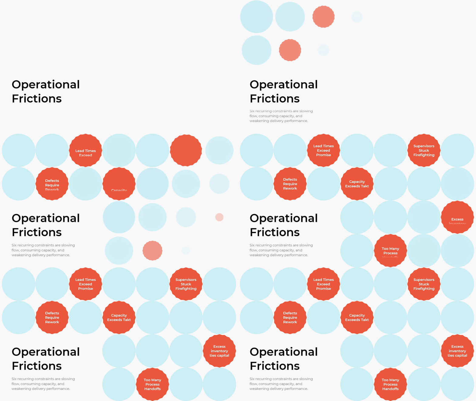
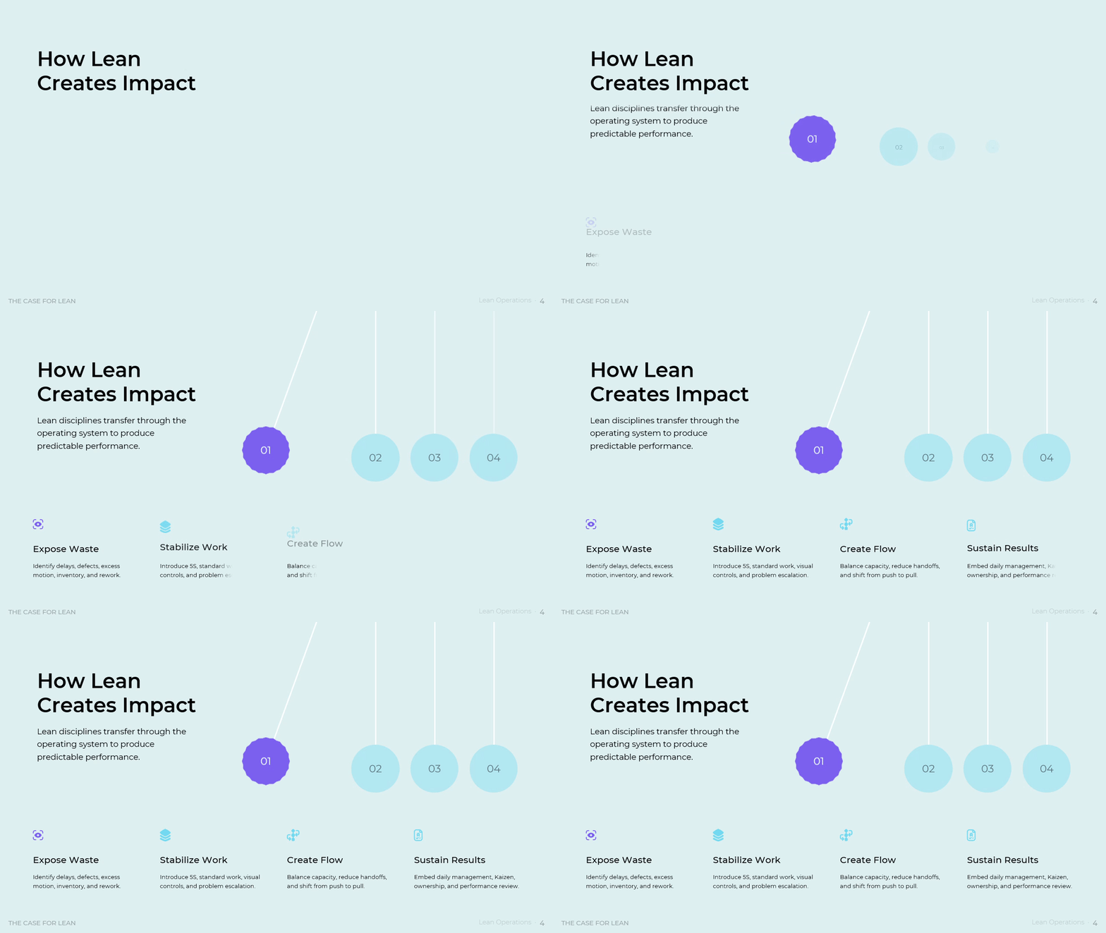
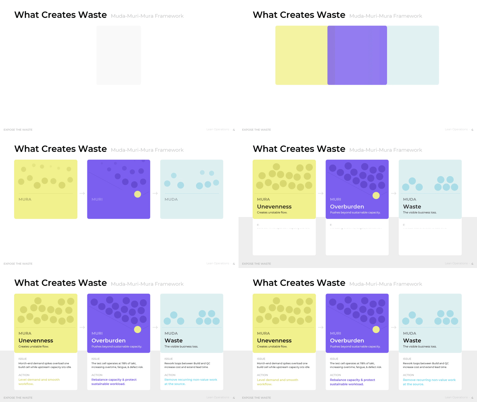







Lean began as the Toyota Production System, built on two pillars that Toyota still names: jidoka, described by the company as automation with a human touch, and Just-in-Time production. Toyota also names three enemies of flow in its own words: muda, mura, and muri. McKinsey observes that leadership attention has shifted away from these core principles of operational excellence, which leaves considerable value on the table.
How to See Waste Before It Reaches the Customer
Waste survives in most operations because it hides inside accepted routine. An approval queue looks like governance. Duplicate data entry looks like diligence. This part of the framework separates the work a customer pays for from the work that only consumes capacity. Once that split becomes visible, cost reduction stops being a headcount argument and turns into a process decision operations can defend with evidence.
The scale is easy to underestimate. The US Environmental Protection Agency's Lean and Environment Toolkit reports that some companies discovered as much as 40 percent of their chemical supplies went unused and became hazardous waste directly, because stock expired or turned obsolete. Waste of that size rarely appears in a financial report as a single line. It appears as normal operating cost, which is why nobody challenges it.
Managers reach for the value mix when a cost target lands and no two departments agree on where the excess sits. The framework splits total process time into three bands: value-added work at roughly 5 percent, necessary non-value-added work such as compliance checks, regulatory approvals, and invoicing at roughly 40 percent, and pure waste such as waiting, duplicate entry, excess movement, rework, and searching at roughly 55 percent. Teams should replace the illustrative percentages with a real time study of one product family, then resist the urge to attack the necessary band first. Regulatory work cannot be deleted. It can only be simplified.

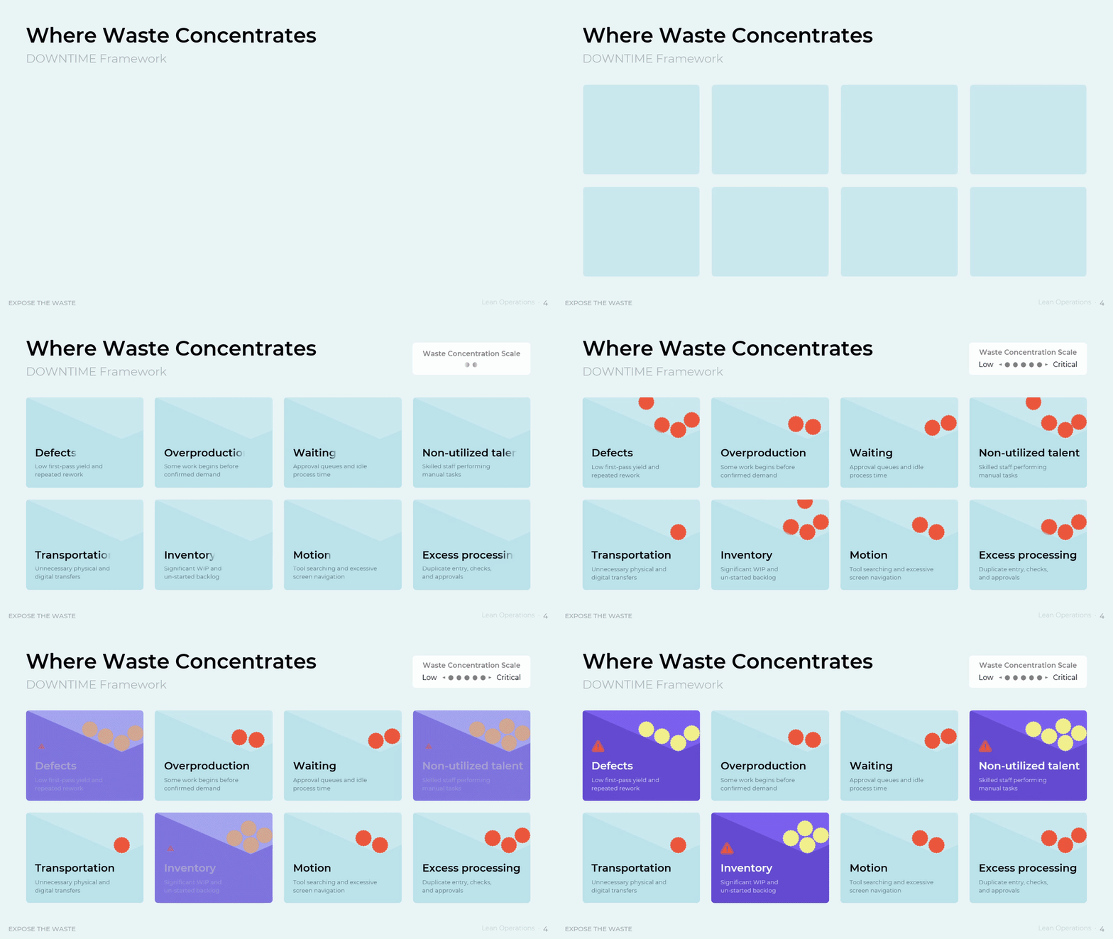
The DOWNTIME view suits the moment when a team knows waste exists but cannot name it. It sorts loss into eight categories: defects, overproduction, waiting, non-utilized talent, transportation, inventory, motion, and excess processing. Each category carries a one-line diagnosis and a position on a concentration scale that runs from low to critical, so the heaviest three separate from the rest instead of competing for attention. In this baseline, defects, non-utilized talent, and inventory sit at the critical end. Teams should score every category with observed evidence rather than opinion, because this ranking decides where the first improvement event goes and what the plant lead defends in the next review.
The Gemba walk structure matters when leaders suspect that reported data and floor reality have drifted apart. It runs as a four-step loop: prepare and define the focus, go and see the work, ask why to find the cause, and follow up to confirm the change held. A six-item observation list keeps the walk from turning into a tour: safety risks, quality defects, bottlenecks, waste, standard work adherence, and visual controls. One rule protects the whole method. Observe the process, not the people, and ask rather than tell. Walks that break that rule collect silence instead of causes.

Value Stream Mapping and the Economics of Flow
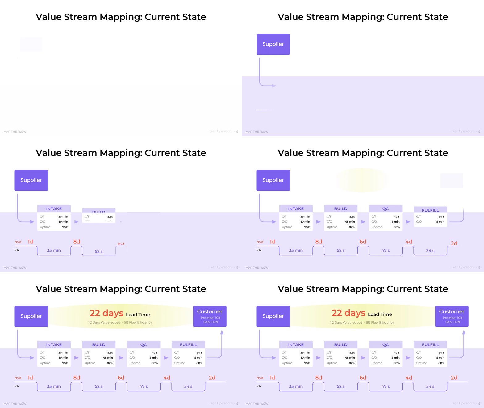
Lead time is not a scheduling failure. It is a design outcome. Value stream mapping shows the full path from supplier to customer with queue time above the line and processing time below it, which moves the argument from individual departments to the whole flow. The Lean Enterprise Institute puts it plainly: mapping shows more than waste, it shows the sources of waste, and it links material flow to information flow in a way no other tool does.
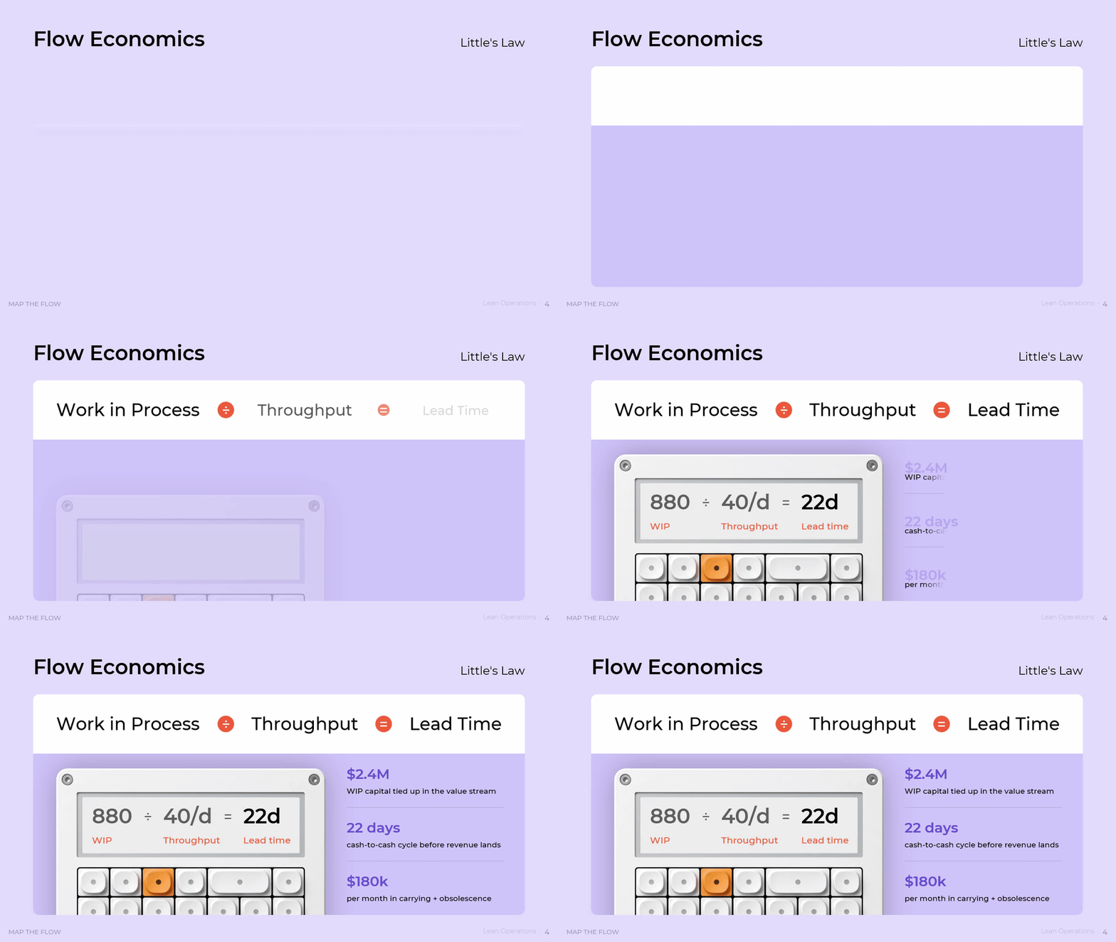
The economics behind that diagnosis are settled. John D. C. Little proved in 1961 that in a stable system the average number of units present equals the arrival rate multiplied by the average time each unit spends inside. In operations terms, lead time equals work in process divided by throughput. The result holds without assumptions about arrival or service distributions, which explains why less work in process shortens lead time even when nobody works a second faster.
The current-state map earns its place when a promise date and an actual date keep diverging and no one can say which step causes it. Four process boxes run from intake through build, quality control, and fulfilment. Queue days sit above the timeline at one, eight, six, four, and two days, while value-added time sits below it in minutes and seconds. The arithmetic produces 22 days of lead time against 1.2 days of value-added work, a flow efficiency of 5 percent, and a gap of twelve days against a ten-day promise. Teams should pull queue times from system timestamps rather than from memory, because the queue bars, not the process bars, hold almost all of the available gain.
The flow economics view converts that map into money, which is the version a finance director will act on. It applies Little's Law directly: 880 units of work in process divided by throughput of 40 units a day produces 22 days of lead time. The same inventory position translates into 2.4 million dollars of capital held inside the value stream, a cash-to-cash cycle of 22 days before revenue lands, and 180 thousand dollars a month in carrying cost and obsolescence. Teams should count work in process physically once before they trust the system figure, since shadow inventory in staging areas and unstarted backlog is where the number usually breaks.
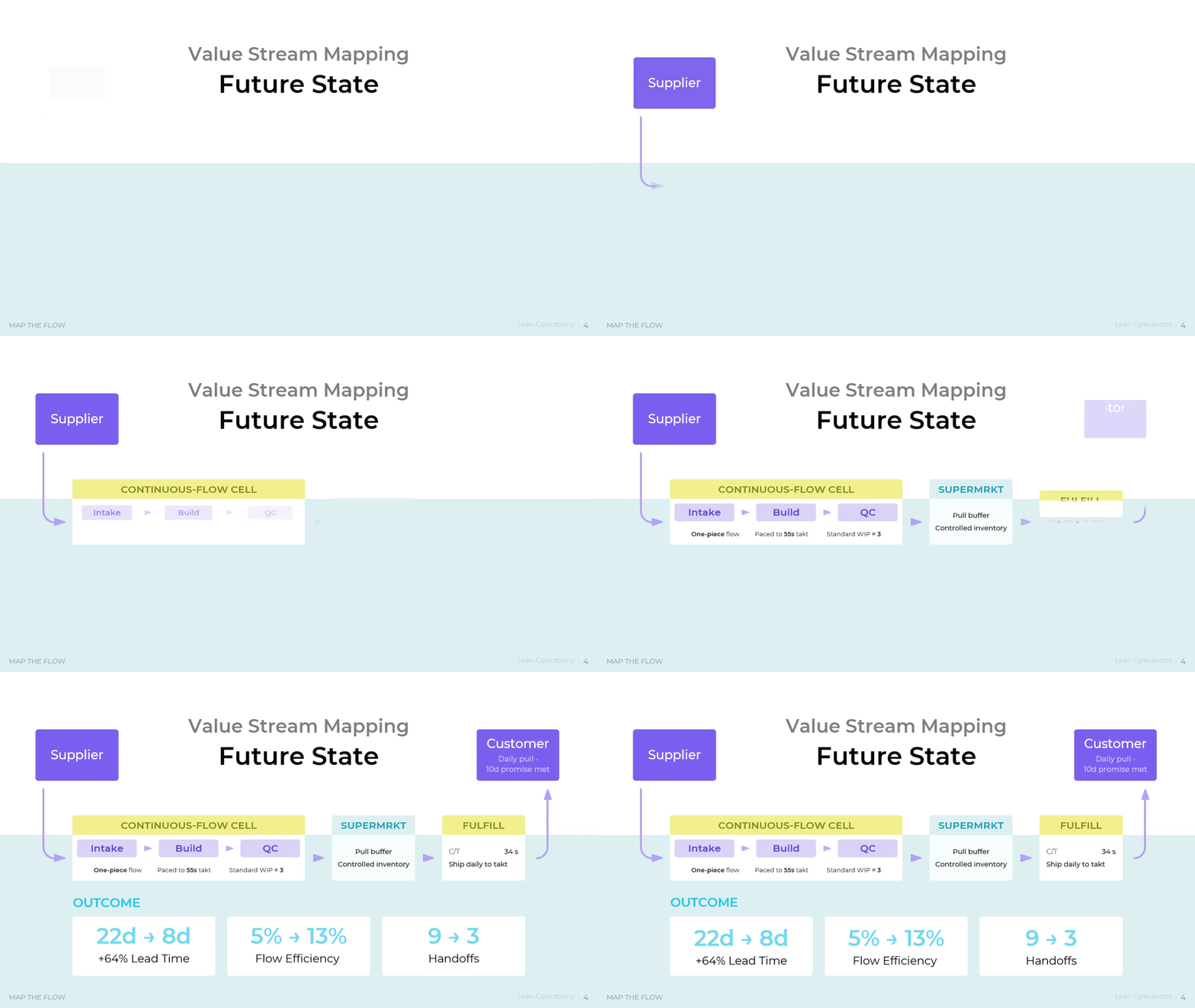
The future-state map is the design step, and it belongs in the room only after the current state is agreed. It links intake, build, quality control, and fulfilment into a continuous-flow cell with one-piece flow paced to a 55-second takt and a standard work in process of three units, then places a supermarket pull buffer at the point where continuous flow cannot extend upstream. Shipment moves to a daily pull against the ten-day promise. Handoffs drop from nine to three, lead time from 22 days to 8, and flow efficiency from 5 percent to 13. Teams should follow Lean Enterprise Institute guidance and schedule only the pacemaker process, then let the supermarkets control everything upstream of it.
Download presentation

Lean Operations
PowerPoint
21 Slides
To continue, enter your email:
Pull Signals and Standard Work Replace Push Scheduling
Push scheduling releases work whenever a station looks free. The result is a value stream full of started but unfinished orders, and a supervisor who cannot tell which order matters today. Pull inverts the logic. Downstream consumption authorizes upstream production, and a hard limit on work in process forces problems into the open rather than into a queue. Standard work then locks the gain so it survives a shift change and a new hire.
Toyota states the rules for this behaviour in three lines: make only what the customer needs, when it is needed, and in the amount needed; do not allow goods or information to be held up during production; and produce at the pace at which items sell. Those rules explain why a plant with excellent equipment utilization can still miss delivery dates. Utilization measures how busy a machine is. Pull measures whether the value stream moves.
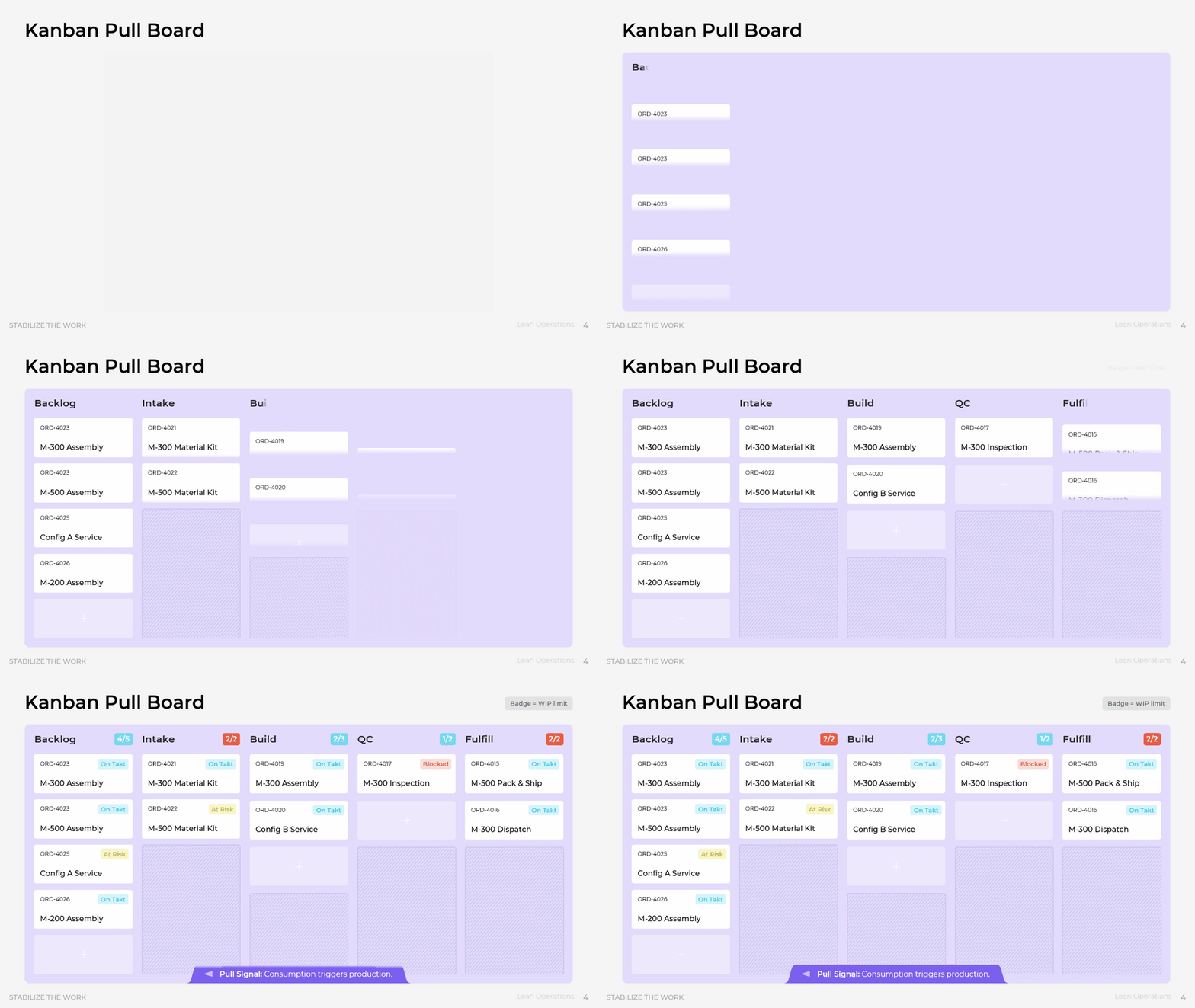
The pull board suits the daily control moment, when a supervisor needs to know in ten seconds where the constraint sits. Columns run from backlog through intake, build, quality control, and fulfilment, and each column carries a badge that shows the work in process limit against the current count. Individual cards hold an order number, the item, and a status of on takt, at risk, or blocked. Consumption in a downstream column is what triggers a pull from the column before it. Teams should set the limits from measured capacity rather than from ambition, and treat a column at its ceiling as a signal to send help rather than to add another card.
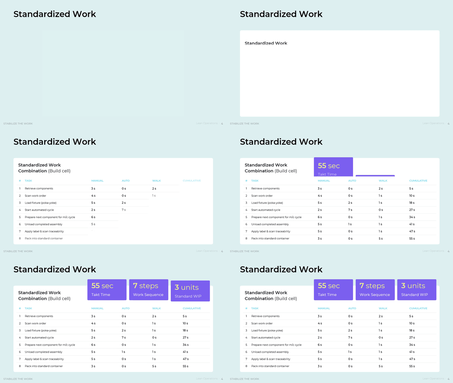
Standardized work belongs in the discussion the moment two operators produce two different cycle times on the same cell. The combination sheet breaks the build cell into numbered tasks and splits each one into manual, automatic, and walk seconds, then accumulates them to a total that must land inside the 55-second takt. Standard work in process for the cell is fixed at three units. One task loads a keyed fixture, so the standard carries a poka-yoke inside the sequence rather than as a separate inspection. Teams should time the steps at the cell rather than at a desk, confirm that cumulative time lands under takt instead of exactly on it, and reissue the sheet every time an improvement changes the order of work.
Quality Built Into the Process, Not Inspected After It
Inspection finds defects. It does not prevent them, and it adds cost at every station where it happens. Quality at the source moves the control point upstream to where the error is possible, so the defect cannot be created rather than cannot escape. That changes the cost profile of the whole operation, because rework consumes capacity twice: once to build the fault and once to remove it. It also shortens lead time, since rework loops between build and inspection are among the longest queues in most value streams.
Most organizations cannot see this cost clearly. The American Society for Quality separates the cost of quality into prevention, appraisal, internal failure, and external failure, and its 2025 ASQE Insights on Excellence Cost of Quality Report found that only 31 percent of respondents feel they fully understand how quality costs affect financial performance. Prevention spending is easy to cut in a hard quarter because failure cost sits in a different budget line and arrives later.
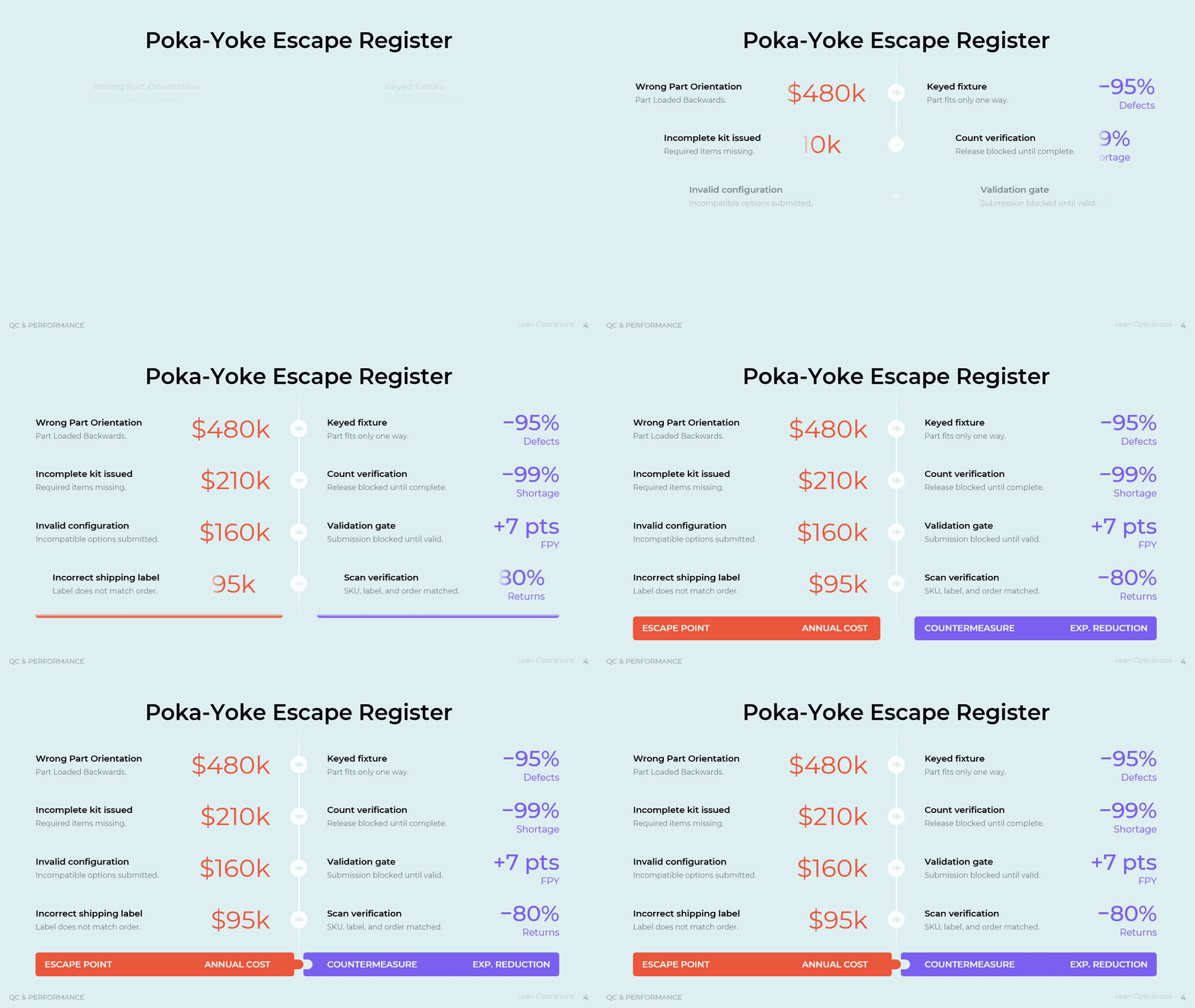
The escape register turns prevention into a ranked investment case, which is what a plant needs when several fixes compete for the same engineering hours. Each row names an escape point, its annual cost, the countermeasure, and the expected reduction. Wrong part orientation costs 480 thousand dollars a year and takes a keyed fixture so the part fits one way only, for an expected 95 percent cut in defects. An incorrect shipping label costs 95 thousand and takes scan verification that matches SKU, label, and order, for an 80 percent cut in returns. An invalid configuration costs 160 thousand and takes a validation gate that blocks submission, worth seven points of first-pass yield. An incomplete kit costs 210 thousand and takes count verification that blocks release. Teams should enter the annual cost before the countermeasure, because the cost column, not engineering preference, sets the order.
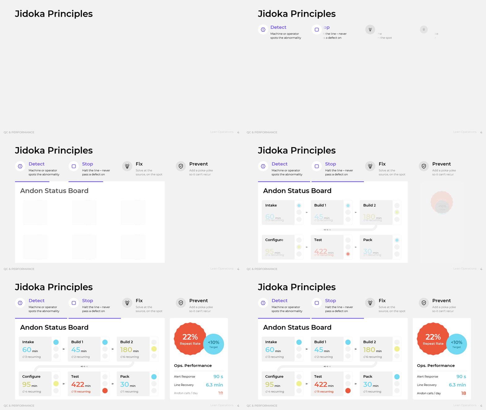
The jidoka and andon view governs the response loop once a problem does occur. Four steps define the discipline: detect the abnormality, stop the line rather than pass the defect on, fix the issue at the source on the spot, and add a poka-yoke so it cannot recur. Alongside it, a status board ranks stations by downtime minutes and by recurring count, and one station stands well clear of the rest with 422 minutes and eleven recurring issues. Response metrics frame the health of the system: alert response in 90 seconds, line recovery in 6.3 minutes, 18 andon calls a day, and a repeat rate of 22 percent against a target below 10. Teams should read the repeat rate before the call count. Many calls with few repeats shows a system that learns. Few calls with many repeats shows a floor that has stopped speaking up.
Download presentation
Lean Operations
PowerPoint
21 Slides
To continue, enter your email:
From Daily Metrics to Strategy Deployment
Improvement decays without a measurement rhythm and an owner. Most lean programmes stall not because the tools fail but because nothing in the management calendar protects them once the next crisis arrives. This part of the framework connects the shop-floor number to the annual objective, so a kaizen event has a visible line back to a company target and a named leader who reviews it on a fixed day.
The Shingo Institute frames the reason directly. Ideal results require ideal behaviours, and purpose and systems drive behaviour, which means tools answer how while principles answer why. Organizations that adopt tools without a redesigned management system get a short spike and a long slide back. A measurement board and a deployment matrix are the two systems that hold behaviour in place after the enthusiasm fades.
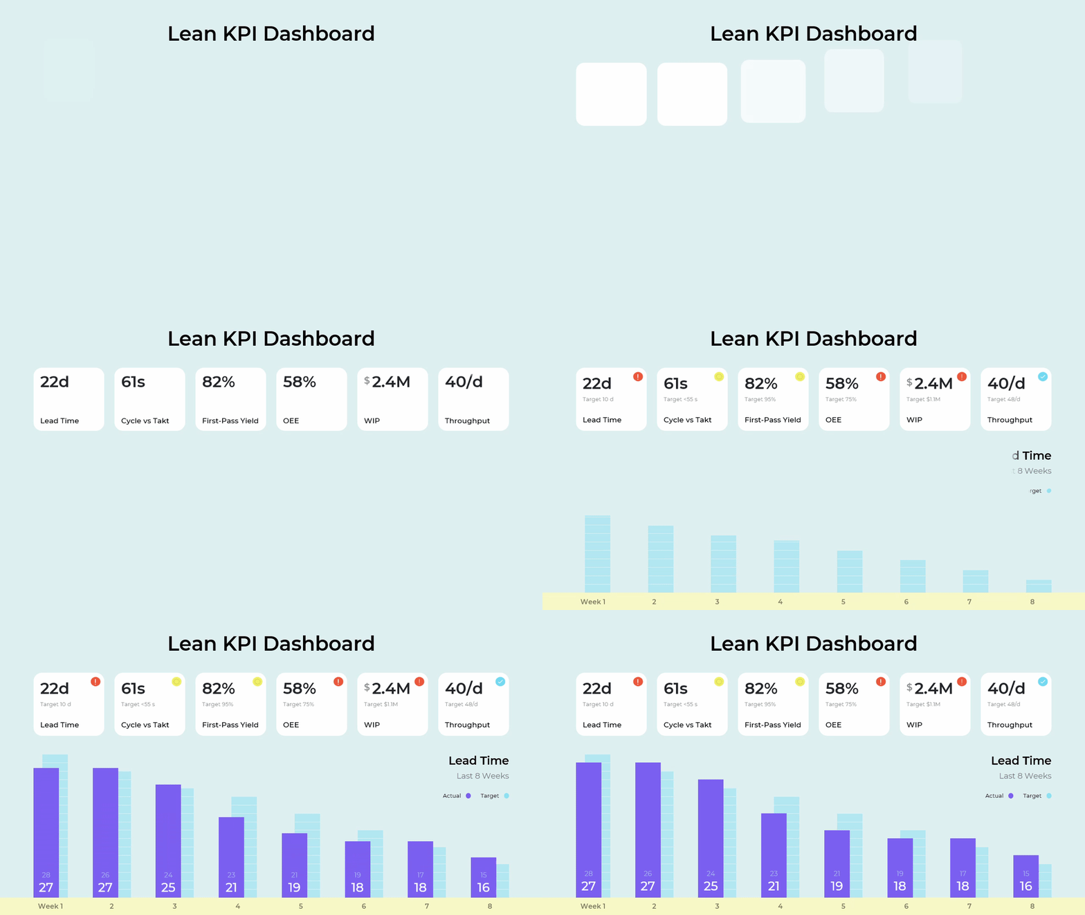
The performance dashboard is the daily control layer, useful in any review where opinion currently outranks data. Six tiles pair an actual value with a target: lead time of 22 days against 10, throughput of 40 a day against 48, work in process of 2.4 million dollars against 1.1 million, overall equipment effectiveness of 58 percent against 75, cycle time of 61 seconds against a takt under 55, and first-pass yield of 82 percent against 95. An eight-week trend plots actual lead time against target so direction is visible, not just position. Teams should treat the cycle-versus-takt tile as the early warning, because a cell that runs above takt will generate overtime, fatigue, and defects before any other number moves.
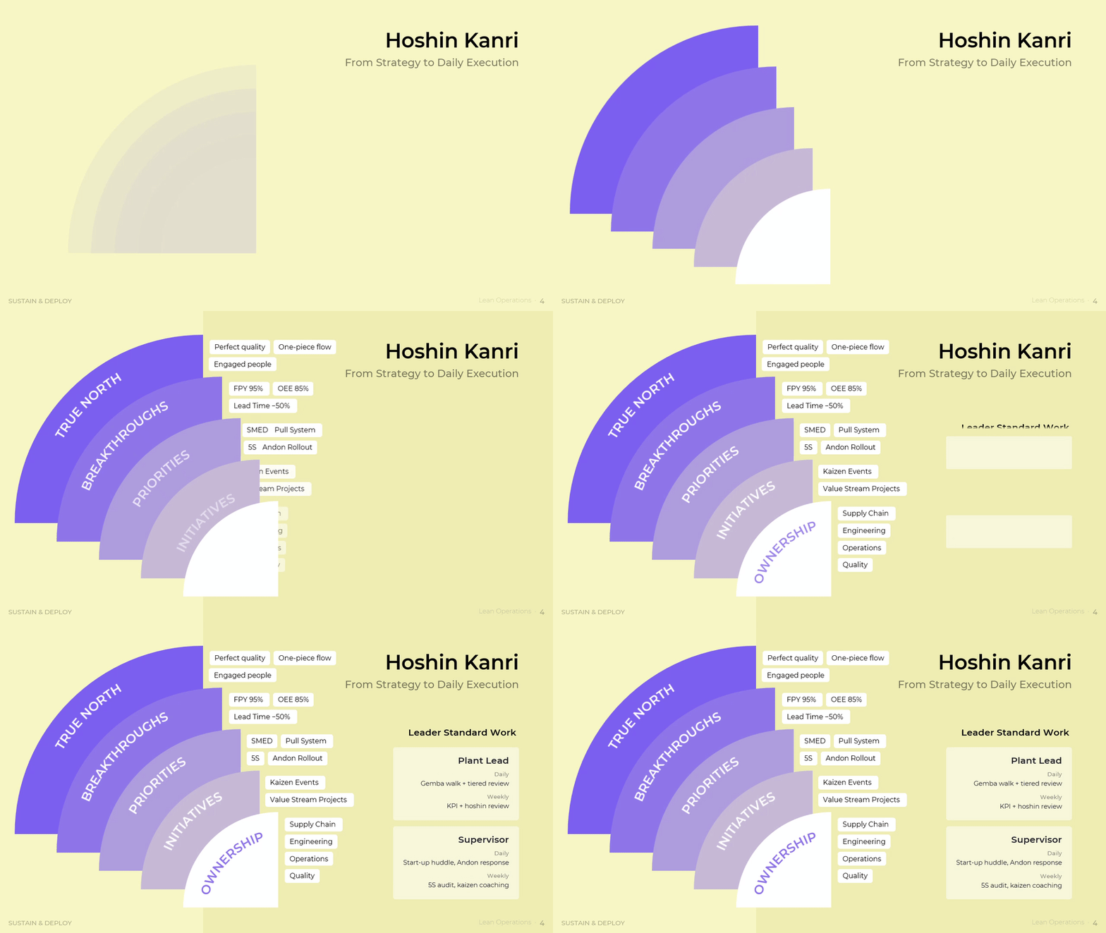
Hoshin Kanri is the layer executives ask for when several improvement programmes run in parallel with no visible link to strategy. It cascades through five tiers: true north as the enduring aim of one-piece flow, engaged people, and perfect quality; breakthroughs as measurable multi-year targets such as a 50 percent lead time reduction, 85 percent equipment effectiveness, and 95 percent first-pass yield; priorities such as pull, andon rollout, SMED, and 5S; initiatives as the kaizen events and value stream projects that deliver them; and ownership assigned across operations, quality, supply chain, and engineering. A leader standard work panel fixes the cadence, with a daily gemba walk and tiered review plus a weekly KPI and hoshin review for the plant lead, and a daily start-up huddle and andon response plus a weekly 5S audit and kaizen coaching for supervisors. Teams should confirm every breakthrough traces to one named owner and one recurring meeting, because a target without both is a wish.
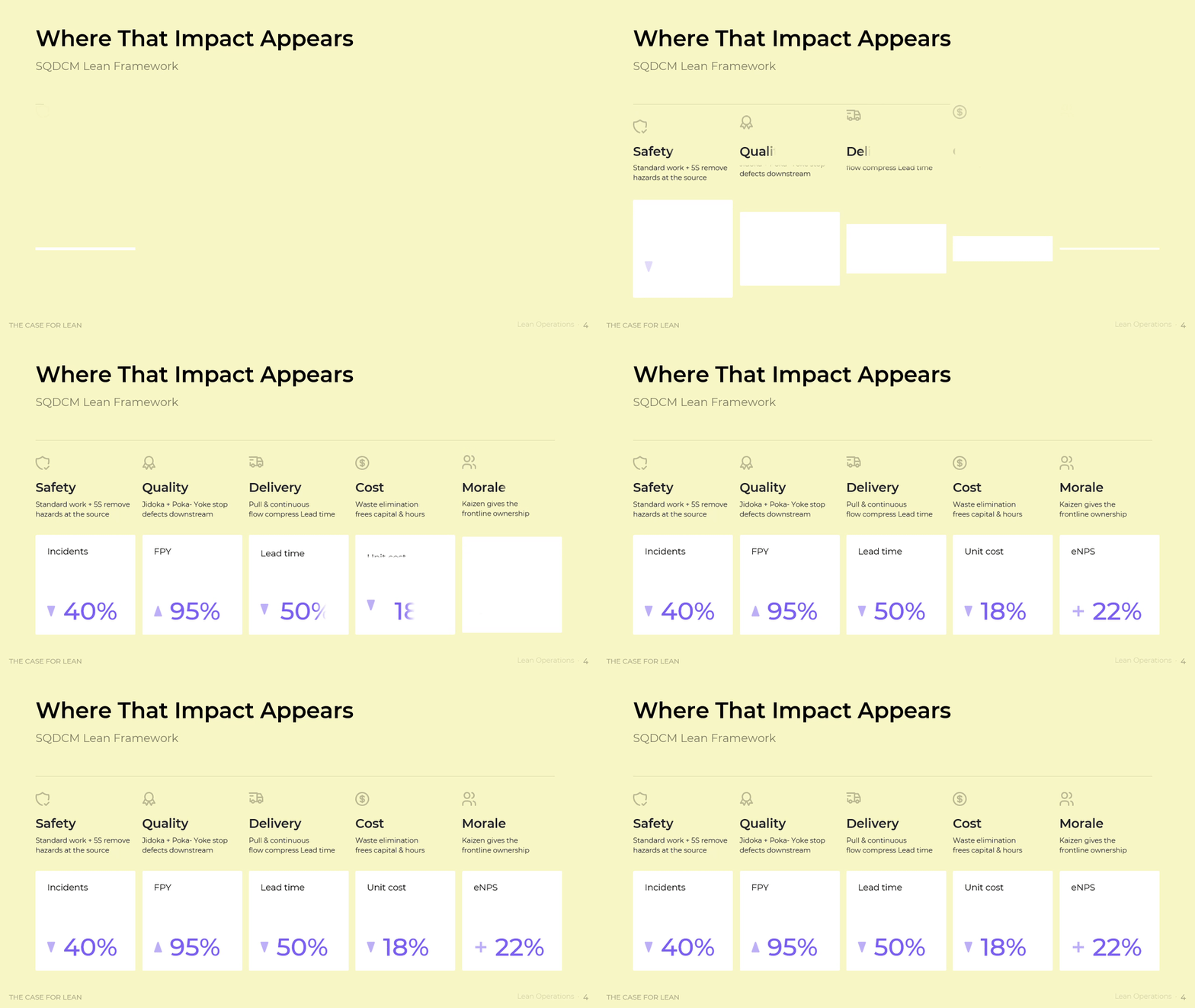
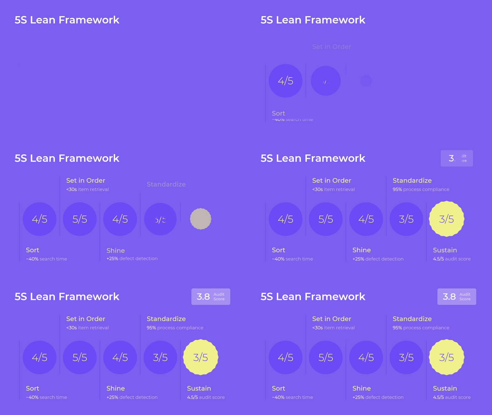
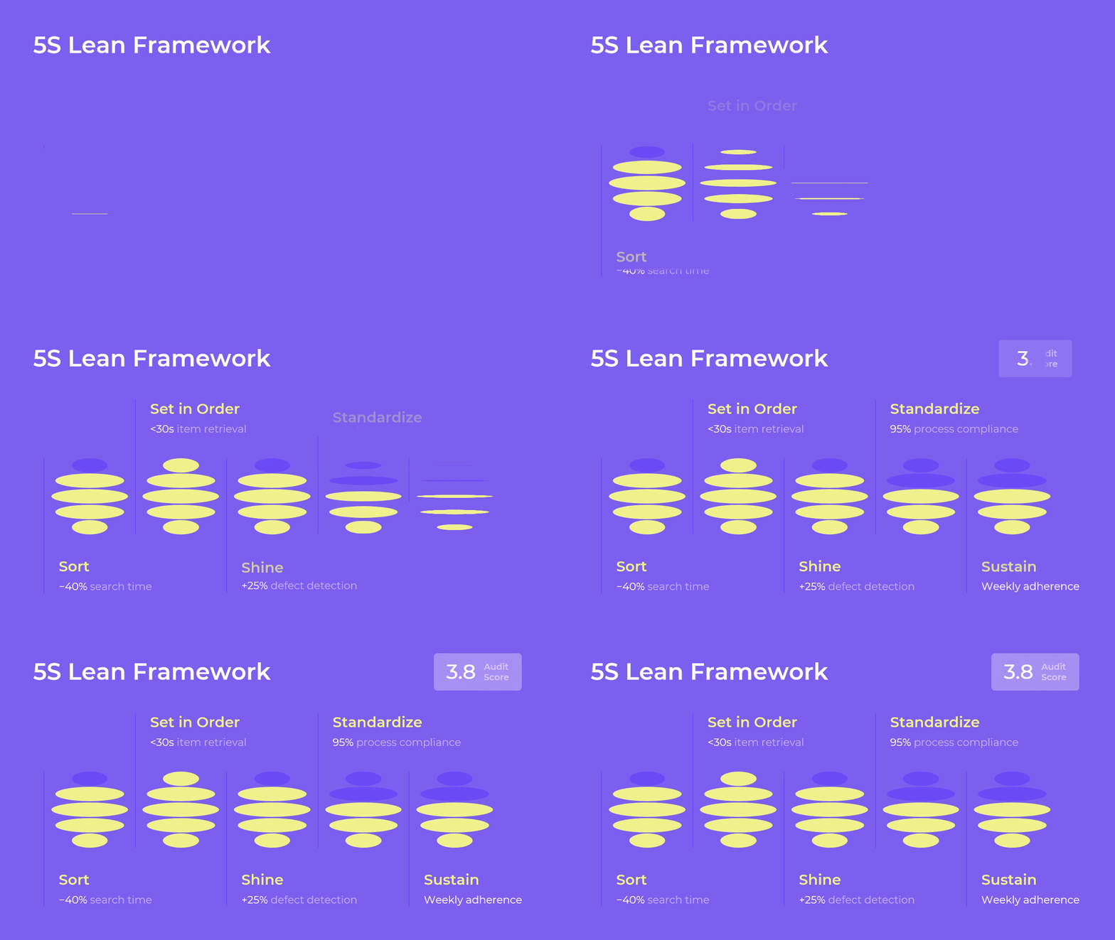
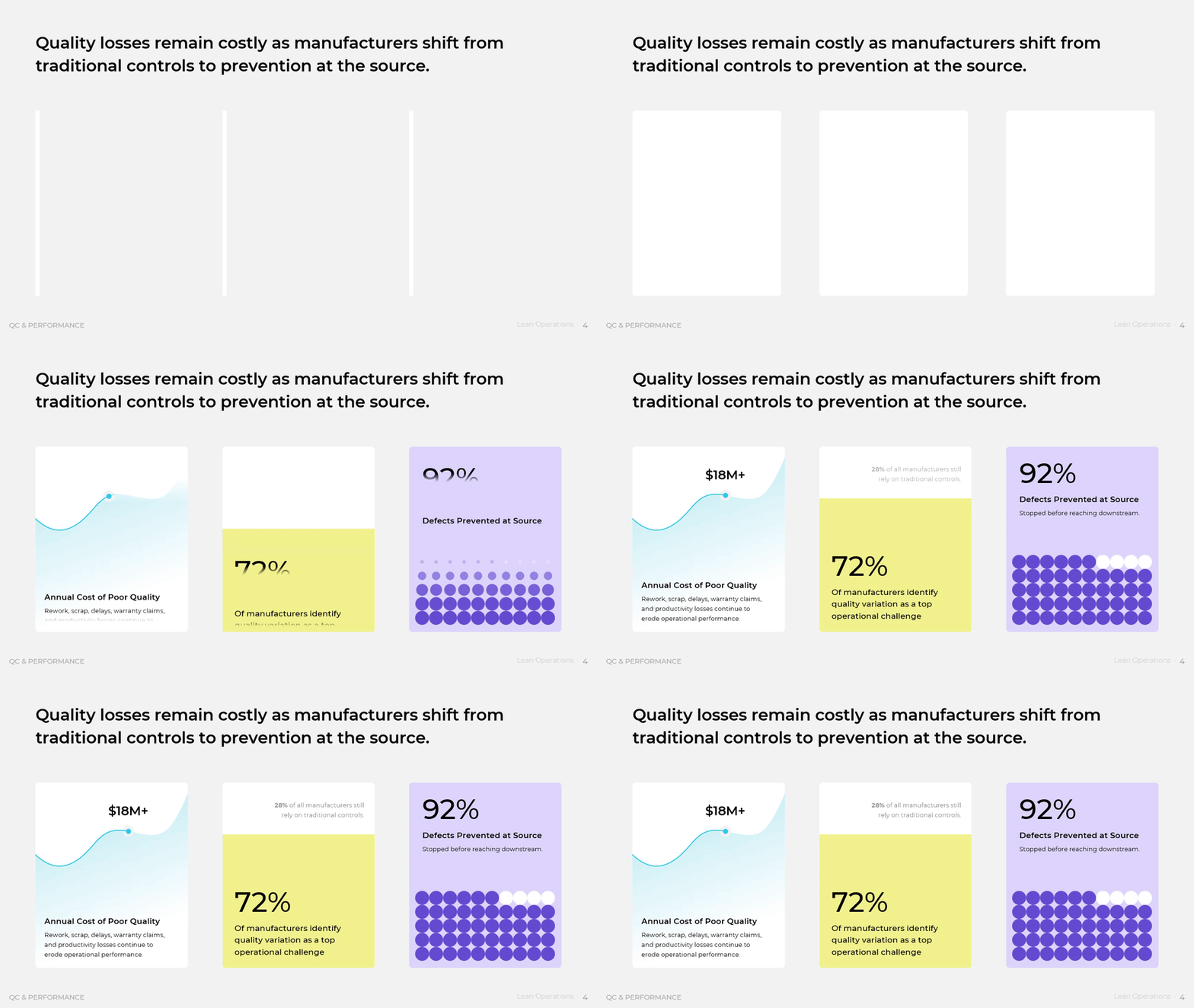
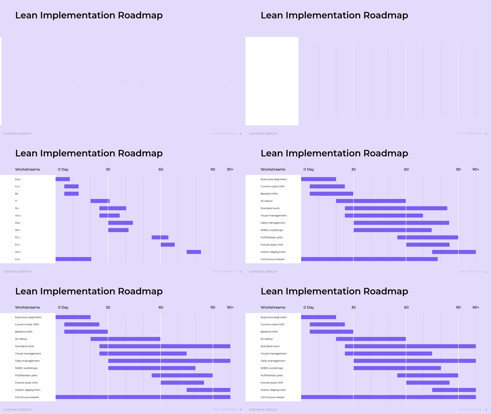
The sequence in this framework is what gives it durability. Waste is exposed before it is attacked, so effort lands where loss concentrates rather than where it is most visible. The value stream is mapped before it is redesigned, so a flow efficiency of 5 percent becomes a measured baseline instead of an argument. Standards and pull stabilize the new design, quality controls move upstream to the point of possible error, and a 5S audit score protects the physical conditions that make standard work possible. The SQDCM view ties each of those moves back to safety, quality, delivery, cost, and morale, and a 30, 60, and 90 day roadmap paces the rollout so a plant is not asked to change everything at once. What emerges is not a set of projects but an operating system with a heartbeat: a daily walk, a weekly review, a visible number, and an owner for each. Organizations that build it stop rediscovering the same eighteen million dollars of poor quality every year, and start treating flow as the discipline that decides whether strategy reaches the floor at all.
Download presentation
Lean Operations
PowerPoint
21 Slides
To continue, enter your email: